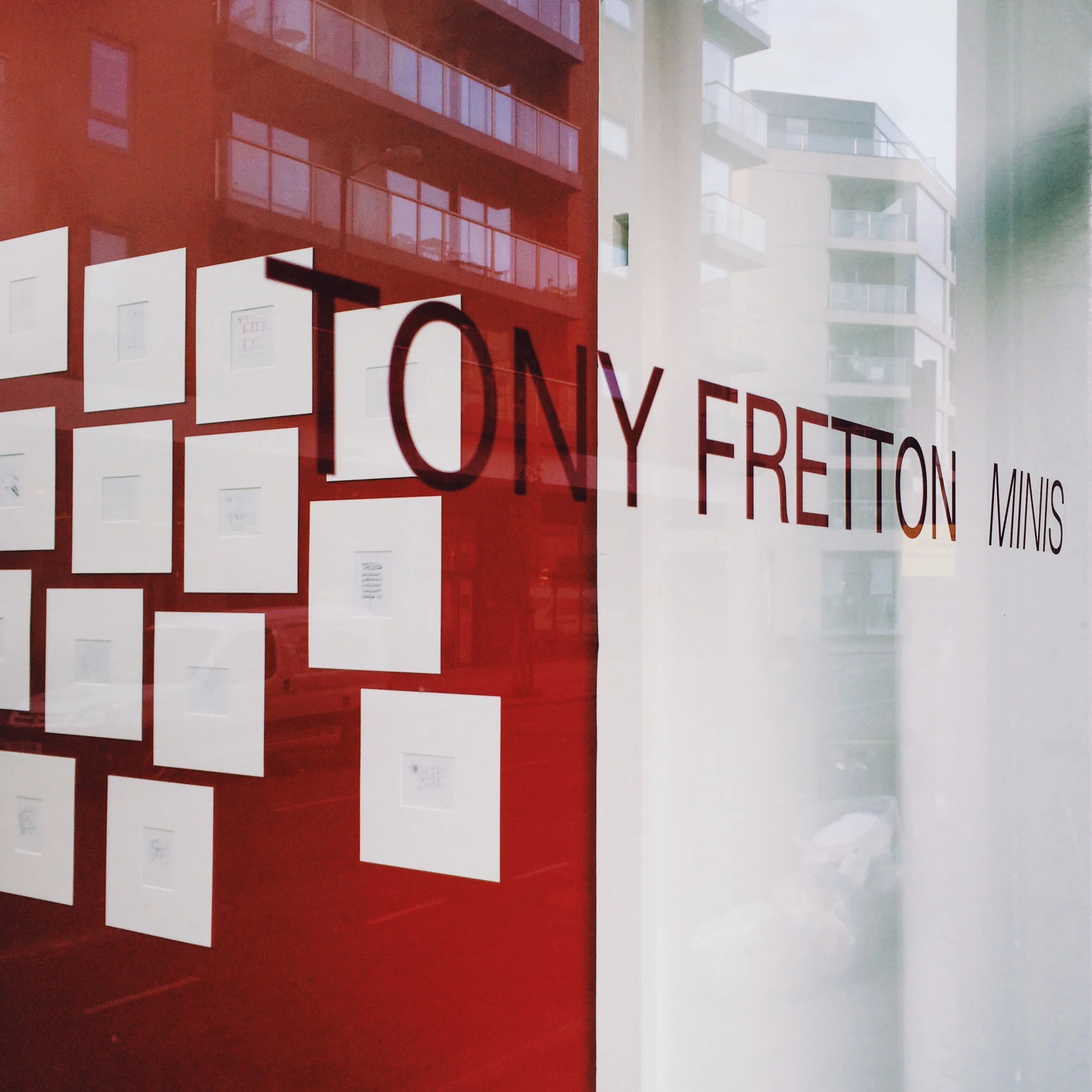
Tony Fretton: Minis
5 May — 5 June 2016
images | text
In what I think is a pioneering exhibition, an architect’s personal digital sketches are presented not as incidental to other modes of architectural representation, such as models, renderings or hard line drawings, but as part of the primary process of design.
I say part because there is a prior range of pencil sketches that Tony Fretton produces to develop schemes with colleagues in his studio. Made in the moment, they are often inscrutable after the event and hence un-exhibitible. In contrast the digital sketches are descriptive-made for himself in order as he says ‘to understand the consequences of decisions made under the pressure of production, and the nature and possibilities of the design’. Their style reflects the rapid changes that have occurred in devices and programs for digital drawing. Sketches for Deinze, Fulham, Neuhausen and Nyborg were drawn with an Apple pen or finger on an iPad or iPhone, and are more fluid than the pixelated sketches for Entrez Lentement and Fuglsang that were made with a stylus on the small screen of a Palm Organizer. The earliest and strangely awkward drawings, represented by the Red House were drawn on a desktop computer using a mouse.
One of these is entitled, perhaps just in my mind, How to relax in the first floor salon of the Red House. I am unsure if it was made before or after the construction of the building, because it has an integrity of its own, unrelated to the utilitarian task of bringing a building into being. The charm of the drawing is that it is full of optimism and uncertainty. It has the restraint of a Mies van der Rohe sketch, the charm of Le Corbusier’s voluptuous boxer in le Jardin suspendu d’un apartment and the underlying doubt of Hamilton’s, Just what is it that makes today's homes so different, so appealing? It is an aide memoir on how to live. The furniture of life is pared back to annotations: Poussin’s masterful painterly illusion of depth, as a ‘window on the world’ is cheerfully erased, while architecturally depicted nature goes on in the salon window, oblivious to the Client’s internally constructing her/himself through this mis-en-scene of the louise (sic) quinze escritoire and blazing log fire.
In his essay Translations from Drawings to Building Robin Evans makes the distinction between building and architecture and writes of architect’s drawing as the translation that brings architecture into being. Without drawing there is no architecture, only building. The significance of Tony Fretton’s approach to design is that it makes a similar distinction, but between architecture and architecture as a premeditated and mediated process through drawing that captures contingent events. When talking about the Lisson Gallery he says
‘By styling the interior spaces in the international language of white minimalism we made them recognisable as art spaces, but also abstract versions of places in the neighbourhood through which you walk to reach the gallery in its peripheral location in a banal area….These ideas came together with more force in the second Lisson Gallery of 1992, where the large north-facing windows place art against a view of the surrounding neighbourhood that is very typical of certain parts of London in being made pragmatically and with a lack of urban design. But in framing the views in this way…we showed the city as a cultural artefact, which is naturally ambiguous and rich with multiple meanings.’
Architects are tasked to know all there is of a situation, to subscribe to the myth of certainty, which is the default mode of the architectural plan. The plan has the comforting sense of an areal flight over a city, showing a seemingly rational organisation of roads, houses, tall building and pockets of green. Only at ground level and in close-up is the city experienced as an aggregate of multiple, often conflicting wants and needs.
It is not often that an architect’s drawings capture the contingency that I have described and for it to be replayed in the fabric of the buildings he goes on to make, but that is what I think is happening in the later sketches. The drawings of Westkaai towers 5 and 6 are both emphatic and contingent. The line in them is shaped not just by what is being drawn but by the space left, the stuff not drawn and not yet known. They seem to me to acknowledge that shaping forces will come after the building is finished, to accommodate them before they are known and in doing so to recognise that architecture is only the start, and that buildings and cities come to full realisation in the minds and actions of others.
- Katherine Clarke - MUF architecture/art, May 2016

